
 English
 English
Review these top 20 best IT website designs and pay attention to what they do well so you can borrow some of their ideas for your IT site design or redesign.
1. Align
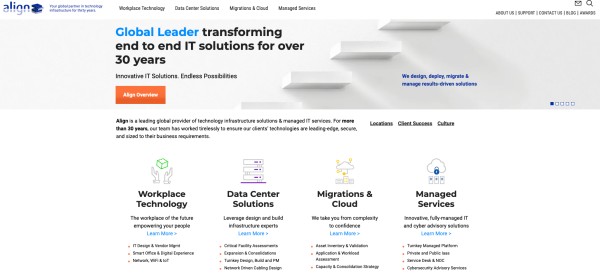
Align is a managed IT services company that offers innovative digital solutions to businesses like cybersecurity, managed IT, and data center solutions. Their website instills a sense of being on top of their game through the use of a clean and simple homepage that provides a quick overview of their key services.
The design supports their brand message of creating infrastructure support and optimization services with its excellent user experience. Information is easy to find and understand while being concise.
2. Align Cybersecurity
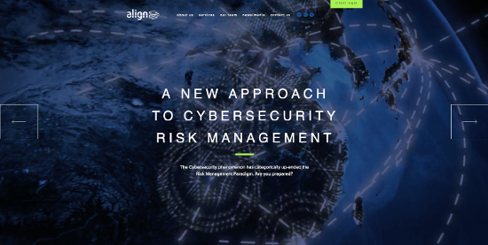
Yes, this is the same Align as mentioned above, but this is a separate website for their cybersecurity division. It warrants a mention as it uses a tweaked website design and theme colors to send a different brand message for their cybersecurity business.
The imagery is darker, and more sinister, while offering a message of strength and confidence.
3. Rapidops
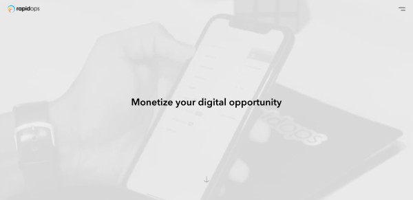
Rapidops is a software development company that develops digital products, platforms, and experiences for their clients that engage users and scale on demand. The homepage hero cycles between several messages just quickly enough to give visitors a clear understanding of the company’s value proposition.
The first screen you see when you visit the homepage is extremely minimalist (in appearance, at least), but can send a powerful message. The use of a hamburger menu icon in the top right is a bit of a controversial choice – digital natives will easily grasp what it is and find it intuitive, but some users may miss it entirely.
As a website designer, you can learn a lot from well organized sites like this one!
4. Cisco
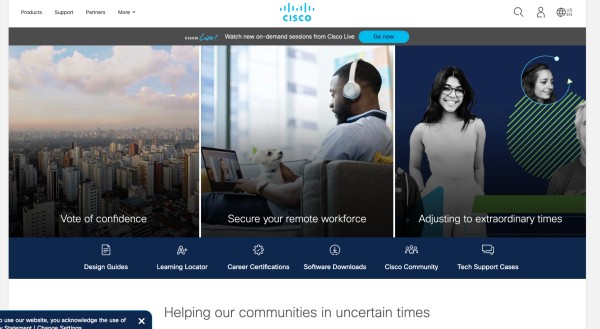
Cisco is a network solutions company with extensive product offerings that connect people, devices and networks. Their website offers a ton of information in an easy to navigate design that makes finding the information you need easy and fast.
Their homepage, while crammed with detail, makes it easy to access the latest information on current company activities happening around the world. It’s a great example of organizing complex information in an accessible way.
5. Intuit Mint
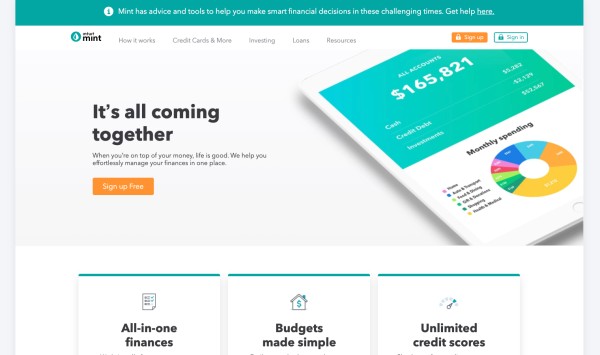
This is a great example of how to say a lot with few words and how images can strengthen your design. Mint is a free financial management app that helps you to track and pay bills, manage your credit score, and set up budgets. The design is easy to digest, just like the app!
It’s also a great example of how speed can make your site shine! Because the site is a clean design, it loads in under three seconds.
We all know faster speed means a lower bounce rate and better SERP ranking since page speed is a factor. When redesigning your website, remember speed is a major factor!
6. vXchnge
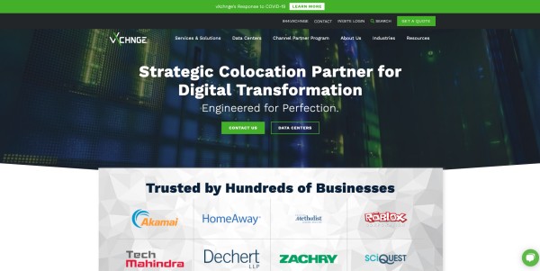
The vXchnge website is a great example of the use of testimonials to build trust. Your initial view upon landing on their pages provides not only a quasi-slideshow of some of their products and services, but some strong social proof in the form of businesses that trust them.
Scroll down and you’re treated to a series of customer testimonial videos that further define who they are and what they do. It’s one of the best IT website examples of the effective use of testimonials to build trust and establish authority.
7. Hewlett Packard Enterprise (HPE)
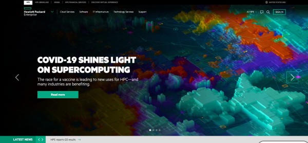
HPE offers companies enterprise solutions for managing the cloud, including hybrid cloud, mobile, and analytics. Their website is clear and concise in terms of information, keeping navigation broad.
Additionally, Hewlett-Packard cycles in different featured images from time to time to keep their homepage fresh without having to do a complete redesign.
Simple graphics help to get their service offerings across to visitors, and visible CTAs offer actionable links for more information. This makes for a well thought-out design.
8. Insight
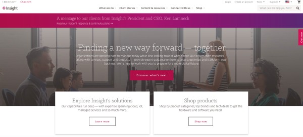
Insight offers smart, cutting-edge tech solutions to businesses worldwide. Using concise information followed by CTAs that are clearly visible as you move through their website, navigation is intuitive.
Images show users working on the products they offer to subtly connect the user experience to the company. This site also clearly defines the benefits of working with them.
9. TechData
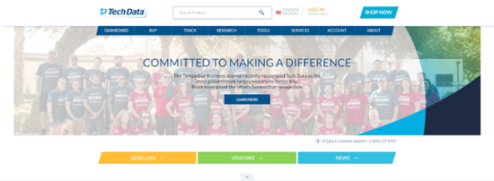
TechData’s homepage is a perfect example of using a simple, uncluttered interface to draw visitors deeper into the site. With several simple headlines that cycle and a CTA to “Learn More,” the initial homepage message is simple and direct.
As you navigate through the site, the subsequent pages offer more in-depth information as you “learn” the TechData story. This is one of the better IT website examples of how to deliver complex information in an easily digestible manner.
10. VMware
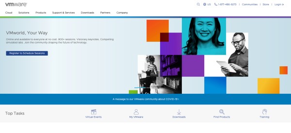
VMware is a cloud host provider offering software as a service (SaaS). Their website features news about product releases and updates, dates of upcoming conferences, and a great user experience with easy navigation and search.
Simply put, this is a great example of establishing authority and providing thought leadership through information sharing.
11. DocuSign
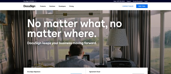
DocuSign offers options to help your office go paperless. Their homepage includes a really great app for calculating the savings your office can reap from going paperless and, in a fun twist, how many trees you’ll help to save in the process.
Such messaging is a great way to establish relevance and show your product’s value in an easy-to-understand way.
12. Dropbox
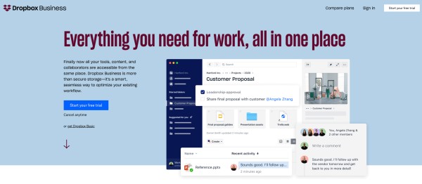
Collaboration and centralization of information are what Dropbox offers its clients.
With a minimalist homepage design featuring a headline that establishes value immediately and a CTA to “Sign up for Free,” it’s a simple approach that offers immediate value while establishing who Dropbox is and what they do.
13. ConnectWise
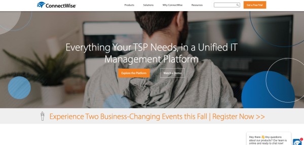
Business management is what drives ConnectWise. They offer business management solutions and customer service support for other technology businesses that improve the efficiency of their clients business.
With over 160 tools, their website clearly shows their offerings and is easy to navigate. By putting services front and center, visitors can quickly determine if there is value in their products.
14. Dropsuite
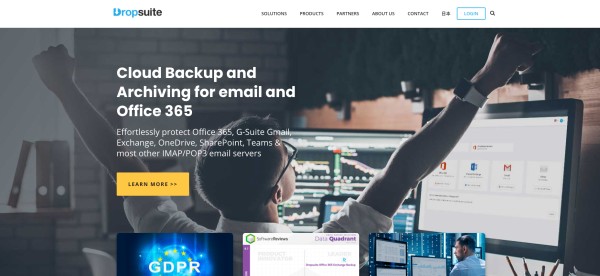
Cloud based data backup, storage, and disaster recovery are critical in today’s online world. Dropsuite offers innovative solutions and tools to meet these needs.
Their website relies on simple design and offers key information in an opening slide show that offers visitors an immediate understanding of who they are, what they do, and why you should utilize their services.
With a simple and uncluttered design, Dropsuite’s site is one of the better IT website examples showing how negative space can draw the eye to important information and CTAs.
15. SkyKick
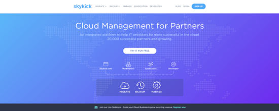
SkyKick offers companies that provide IT services a powerful suite of management tools to help them migrate, manage, and backup their customers on the cloud.
The website features the logos of their many clients, which is an excellent way to establish trust and authority. Including customer logos and testimonials is an excellent strategy for showing value.
16. Workspace 365
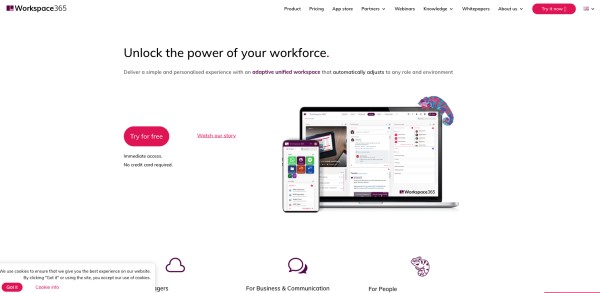
With a growing number of companies relying on mobile workers or telecommuters, collaboration solutions are critical. Workspace 365 offers businesses a cloud-based workspace that makes collaboration easier for any size of business.
Their homepage is a great example of the effective use of video. The Workspace 365 homepage provides a quick explanation of how their solution helps IT managers, businesses, and people.
17. Axcient
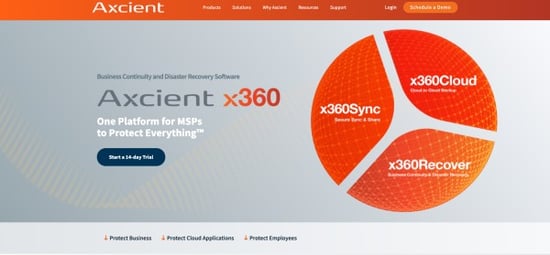
Axcient offers disaster recovery services, and their website is the perfect example of using lead magnets to convert visitors.
When you visit their website, you’re greeted by a hero image that quickly explains what Axcient’s services are while the page content provides more detail about each solution and their benefits.
18. DeliverySlip
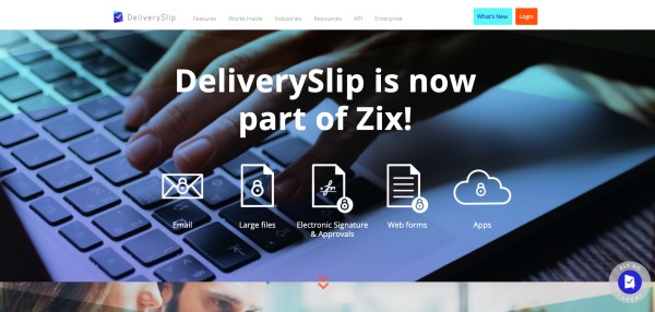
This cloud based encryption service allows you to send secure encrypted email and encrypt files up to five gigs. It also offers real-time tracking all from your mailbox.
Their website features business oriented images that immediately convey a sense of professionalism and trust. The text used is concise and simple giving you an immediate understanding of their services.
19. Dun & Bradstreet
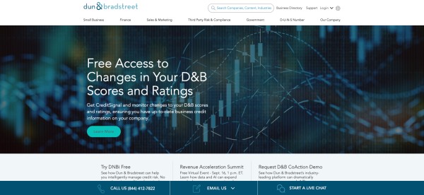
The Dun & Bradstreet website is a great example of using minimalist design and limited text to convey a message.
The homepage clearly displays their logo, along with a search option, business directory, contact button, and online live chat and email options that make it easy to get in touch with their customer service team. It’s basically an extended invitation to engage with the company.
20. PandaDoc
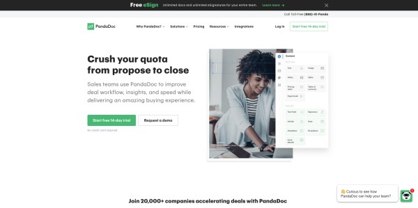
PandaDoc’s website design is a great example of the use of negative space and color.
The headline clearly states the value proposition for the company: “Crush your quota from propose to close.” And the free trial CTA button is green, which is a symbolic representation of the money you’ll make streamlining your new business process using their product.
The homepage CTAs are clear and concise: “Start free 14-day trial” or “Request a demo.” There’s also a live chat feature that you can click to get immediate information about their product.
These 20 IT website examples all share some similarities. They are all clear, concise, and brand focused. Many of these designs feature plenty of negative space to keep the important information front and center, and they all use strong imagery to support their brand identity.
All 20 of these examples are effective at delivering their message in an engaging, user friendly way and can serve as inspiration as you create your own brand identity.
Whether it’s through the use of video, strategic placement of CTAs, using multiple conversion paths, or prominently displaying corporate identifiers and contact information, these 20 websites offer users fast access to the information they’re seeking and work to draw visitors deeper by creating an engaging user experience.